Holidays at Hanks


New holiday chalkboards for Hanks Cafe at 9 1/2 Church St.
We also applied the chalkboard to their Facebook page to make it extra fancy!

Here's the original rough sketch:

#wearenotford

Rob Ford. A few months ago, this name did not mean much to the international community. But after Gawker got a hold of a fake real video of Toronto's mayor allegedly smoking crack cocaine, this name is now a household name around the world. And as the criminal allegations continue to stack up (drunk driving, physical abuse, prostitutes... et al.), Mayor Rob Ford is starting to make Toronto – and Canada – look like a joke.

I took it upon myself to come up with a creative solution for Torontonians and Canadians to reclaim our tarnished reputation. My objective was to address the problem, offer a playful visual solution, and provide a creative and shareable component to the growing anti-Ford movement. Below are the results.

These images can be downloaded and printed or shared on social media. All of the files can be downloaded below, or in the original size on the new blog:

http://wearenotford.blogspot.ca/

C'mon, Canada! Tell your friends, Toronto! Please spread the world on all your social networks.

Let the world know that one bad mayor doesn't spoil the bunch.

Have a great weekend!

CR


*All photos are either property of Christopher Rouleau, or re-appropriated the internet for illustrated purposes. Please contact me if you are the owner and would like your image removed.

Alex & Jeremy


Back in the summer, I was asked to create a typographic-inspired wedding gift for a very special Calgary couple. After seeing their wedding invite & website, as well as peek at their Instagram, I could tell they had an affinity for classic architecture, clean lines, with a hint of Art Deco flavour. Above is the final result, and below, a look at some process sketches.

Congratulations, Alex & Jeremy!

Design Thinkers 2013, Day 2

1) Robert Fabricant
VP of Creative at frog design (NYC)
"Mission-driven Innovation"
  • good design is good, celebrated
    • i.e. Twitter is loved, valued because of its simplicity
"Perfection is achieved, not when there is nothing more to add, but when there is nothing left to take away." -Antoine de Saint-Exupery, Airman's Odyssey
"People shouldn't really have to think about an object when they are using it. Not having to think about it makes the relationship between a person and an object run more smoothly... design dissolving in behaviour..." -Naoto Fukasawa
  • frog design's Collective Action Toolkit 
    • booklet for people in developing nations to create their own change
    • learn to solve problems, build new skills, gain knowledge WITHOUT being told how
    • quote from participant "the ideas were in our head all along..."
  • *challenge assumptions of HOW you work - embrace new mindset
    • partners do not = clients (create good will!)
    • seek problem spaces
    • align your interests with the project/client
    • be patient
    • be explicit about your values, objectives - transparency
  • strive to find the intersection of social value and business value
  • never underestimate the power of your craft


2) Michael Gough
VP of Experience Design, Adobe
"If You Have a Brain, You're Creative"
  • "we are ALL creative"
  • liabilities of creative class:
    • never comfortable with one answer
    • never "done"
    • often focus on "insignificant details"
  • benefits of creative class
    • ask awkward questions
    • ability to empathize
    • give form to ideas
    • made connections
    • *can visualize potential outcomes
  • Gough on creative process:
    • Deduction - process of reasoning from one or more general statements
    • Induction - process of reasoning in which the premises seek evidence (inherently uncertain)
    • *Abduction - creatives look for ways to MAKE it true
  • Gough on analog vs. digital
    • true creativity does not happen in the tools / on the computer
    • "drawing makes imagination tangible" 
    • drawn idea / picture is literally worth a thousand words

3) Lara McCormick
School of Visual Arts (NYC), Cooper Type, author of Playing with Type (Rockport, 2013)
Hand-lettering workshop

My sketches from the hand-lettering exercise:
And a more refined version:


4) Cyrus Highsmith
Senior Designer at Font Bureau
"Similar, but Different"
  • good reminder - final usage of type is out of type designer's control
  • get the "idea" into every letter - tell a story with your typeface
    • -the better your story, the better your typeface
  • draw, draw, draw - figure out stuff by drawing
    • -blind contours - draw the shape of SPACE
    • drawing letters informs drawing everything else
  • your work is like a river - always there, changing, flowing - similar, but different.

5) Peter Mendelsund
Associate Art Director of Alfred A. Knopf Books, Art Director of Pantheon Books, Art Director of Vertical Press
"Cover: The Art of the Jacket Designer"
  • *Mendelsund was a classical pianist until age 30 (!)
  • on book jacket design
    • should evolve while reading
    • should act as a pnemonic device, a souvenir of the journey
  • advocates self-initiated projects - complete creative control
  • how to subvert the approval process
    • earn & demand respect
    • stand up for yourself and your ideas
    • don't be afraid to prod people a little
  • Final thoughts:
    • "it has to be beautiful (whatever that means to you)"
    • things should look different than the rest - stand out
    • *"Design less."
    • do your best work from comp #1
    • Triage your work and manage your time accordingly
    • YOU CAN SAY NO!


6) Morag Myerscough
Studio Myerscough (UK)
  • do you what you believe in - do what you really like
  • allow personality into your work (you don't have to keep reinventing yourself)
  • embrace where you came from - use it!
  • don't be afraid of colour!
  • do work that makes people feel better
  • SHOW the possibilities
  • Love what you do.

7) Karin Fong
Co-founder, Imaginary Forces
"Heroes: Super, Design, Real and Imaginary"
  • referred to Joan Ganz Cooney, co-creator of Sesame Street - "edu-tainment"
    • education + entertainment
    • teach through stories
  • the art of film titles
    • connect disparate ideas in a memorable way
    • create a bridge from the everyday to the story
  • don't get too committed to an idea
  • get to the core and work outwards
  • *Make the new thing - do what hasn't been done before.


Day 1 here.

Thanks again to Janine at UPPERCASE for this amazing opportunity. You can also check out the blog post over on the UPPERCASE blog.

All photos property of Christopher Rouleau - please request permission to repost. Thanks!

Design Thinkers 2013, Day 1


I had the privilege of attending this year's Design Thinkers conference in Toronto as UPPERCASE magazine's correspondent. Over the two-day event, I was able to participate in 14 (!) events & lectures by designers and creatives from around the world. It truly was a remarkable experience, and I am excited to share some inspiration from some of my favourite presenters.

DAY 1

1) Christopher Chapman
Global Creativity & Innovation Director at Disney at The Walt Disney Company
"Innovation & Creativity: Purpose, Passion and PENGUINS"
  • Chapman started as an illustrator - followed a little voice that said "you can do better"
  • "design can change things..."
  • "don't settle!"
  • Chapman interested in the effect of passion + purpose
    • definition of purpose: the reason for which something exists
    • example of purpose: male emperor penguins - spend 115 (!) days protecting an egg to bring life about
  • Chapman's inspirations
    • Walt Disney ("Uncle Walt") + his Imagineers
      • interested in innovation
      • EPCOT centre was originally an experimental, sustainable, multi-layer city
    • Eyvind Earle
      • America illustrator 
      • responsible for the styling, background, and colours of Disney's 1959 Sleeping Beauty 
      • painted every day since the age of 12
  • ultimately, when we help others, we feel better
  • depression, anxiety & stress = a high degree of focus on the SELF
  • compassion/kindness pushes negative emotions away
  • adding the human element changes our perspective
  • extrinsic motivation (ie. carrot on the stick, cash bonuses, etc.) DESTROYS creativity
  • purpose-driven work DRIVES creativity
  • referred to Sagmeister
    • strive to turn your job (9-5 burden, "elephant in chains") into a purpose where it no longer feels like work
    • "break the chains"
  • PIXAR employees are kicked out of the office each day because they LOVE their work
  • Chapman on clients 
    • future conferences need to involve designers + clients - education
    • stop talking at each other
    • bring clients with you on the journey
    • walk in their shoes
    • connect on an emotional level
    • dial up the empathy
  • important to communicate with clients using logic, articulation
  • elevate your title - "graphic designer"
  • body gets dopamine from food, sex, and successful collaborations
  • Chapman's final thoughts:
    • find your purpose
    • follow your passion
    • figure out what it is and chase it
    • find your "egg", protect it, and let it give birth
    • the future is ours - change it
    • no civilization has ever survived comfort
    • necessity breeds innovation
    • innovation -> fulfillment

2) Dmitri Siegel
Vice President of E-commerce & Executive Creative Director at Patagonia 
"Dirtbag Design: Building Patagonia's Brand Experience"
  • Siegel spoke of Yvon Chouinard, Patagonia's founder, and his "fun hog" philosophy (#funhogging)
    • Chouinard was interested innovation & sustainability (before it was cool)
    • developed organic cotton in the 1980s - invested in farms
    • one of the first to recycle polyester
  • Patagonia's new brand reflects Chouinard's values
    • back-to-basics, back to core ideas
    • crowd-sourced catalogues - unfiltered, unedited
    • interested in the "real-time world we're living it"
    • strive to be the "most transparent business in the world" - website shows production factories
  • Black Friday / NYTimes campaign - "Don't buy this jacket."
    • encouraged people to think twice about buying a new jacket, shopping on Black Friday
  • "Worn Wear" campaign - "the stories we wear"
    • focus on used clothes, and the stories of customers
    • old clothes are "better than new"

3) Lara McCormick
School of Visual Arts (NYC), Cooper Type, author of Playing with Type (Rockport, 2013)
Modifying Type workshop

A few great reminders from McCormick:
  • letters have lots to learn from calligraphy
  • revival typefaces can be created using any source material earlier than 1927
  • with type/work/life, always push it up a notch
  • Malcolm Gladwell Outliers + the "10,000-Hour Rule" - the key to success in any field is a matter of practicing a specific task for 10,000 hours
  • practice, practice, practice
My lettering sketches from the modifying type exercise:

And a more refined version:


4) Monotype Imaging 
Allan Haley's "Type Quiz"!


5) Darhil Crooks
Creative Director at The Atlantic
"Print in the Digital Age"
  • The Atlantic "of no party or clique"
    • -published in Boston since 1857
    • -history of big ideas, cultural criticism
    • -current affairs, not news
  • always makes things look as good as possible
  • surround yourself with smart, creative people
  • "Print is not dying. It's in rehab."
    • print will reinvent itself, but will prevail because of the appeal to human senses (see, touch, smell) - the human connection prevails

6) Alex Trochut
Illustrator, designer and typographer (Barcelona / Brooklyn)
"More is More"
  • Trochut on originality:
    • don't be afraid to copy - everyone's doing it
    • we are all "listening and imitating the sounds of others"
Nothing is original. Steal from anywhere that resonates with inspiration or fuels your imagination. Devour old films, new films, music, books, paintings, photographs, poems, dreams, random conversations, architecture, bridges, street signs, trees, clouds, bodies of water, light and shadows. Select only things to steal from that speak directly to your soul. If you do this, your work (and theft) will be authentic. Authenticity is invaluable; originality is non-existent. And don’t bother concealing your thievery - celebrate it if you feel like it. In any case, always remember what Jean-Luc Godard said: “It’s not where you take things from - it’s where you take them to.” -Jim Jarmusch, The Golden Rules of Filming
  • Trochut on designing:
    • treat letters as abstract shapes; type = illustration
    • don't be afraid to throw away your best idea
    • as creatives, our process has gone from intensive (limited, focussed) to extensive (abundance, overload) - more to REMIX
    • must be able to access mental database quickly, effectively
  • Trochut on digital vs. analog:
    • digital tools give us unprecedented control; analog tool make beautiful, unexpected accidents
    • precision vs. randomness
    • find the balance
  • Trochut's final thoughts:
    • the easy is comfortable, but ends up being BORING

7) Nicholas Felton
Co-founder of Daytum.com
"Collect + Code: Feltron Reporting"
  • interested in data visualization and tracking personal events and experiences - quantified expressions
  • has been creating personal "annual reports" since 2005
  • Felton on collecting data
    • "Archaeological" approach - collect pieces, remnants
      • -challenges: often incomplete data set, hard to extend, extrapolate
    • Hoarding approach - keep everything
      • -challenges: expensive, addictive, limited
    • Sampling approach - gather data through random samples of self & others
      • -created Reporter app to gather data from self; gave friends slips to input data about him online
      • -best technique - value in incompleteness
  • new element of communication emerging - text, image, ____
  • *reduced choice / limitations / parameters often increases expression and makes us more decisive, productive


Day 2 coming tomorrow!

Thanks again to Janine at UPPERCASE for this amazing opportunity. You can also check out the companion blog post over on the UPPERCASE blog.

All photos property of Christopher Rouleau - please request permission to repost. Thanks!

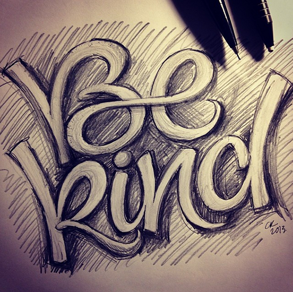
The Making of Be Kind


One evening a few weeks ago, I was doing some late night lettering and came up with this sketch (pictured above).  It was quite spontaneous, but I was really pleased with the overall effect.

I decided to take this design and try my hand at a lino cut print. This method – essentially carving your own rubber stamp – involves using a small, sharp cutting edge, and meticulously remove all areas of the lino tile where you do not want ink to touch.

I really wanted to capture a raw, "sketched" quality, so I took special care with each cut to echo existing shapes. Below are a few shots of the cutting process:

My dear friend Tanya at snap+tumble offered to let me try out my lino on one of her amazing presses. As it turned out, we couldn't lock the tile securely in any press, so we went with the conventional method. The gold ink (generously donated by Tanya!) was applied onto the brayer (roller), rolled onto the lino tile, and then the black stock was hand-registered using tape marks. Below are some beautiful behind-the-scenes shots from the studio, taken by Tanya Roberts:

And, editioned:

I am so incredibly happy with the results of this piece that I will certainly be creating more lino cut pieces in the future. Thanks again to Tanya for making this piece come to life!

If you like the print, please purchase your own limited edition copy in my shop! More photos from the original launch here.

Have a great weekend!

The Making of the 2014 Holiday Cards

Back in April, I was asked by Kid Icarus studio if I would be interested in a greeting card collaboration. I enthusiastically accepted!

After a busy spring/summer, I dedicated a good chunk of time in September to creating a series of four hand-lettered holiday cards. I was inspired by classic Christmas song lyrics, especially ones with repetitive sounds/phrases. I started in pencil, but quickly switched to coloured markers and brush pens once the ideas started flowing.

Below is a series of 6 sketches, showing how my designs evolved.


And these are the four layouts I selected for the final versions.

Below are the final versions, showing the two overlapping layers of text. The final lettering was all created with a Pentel brush pen, scanned, and refined in Illustrator. The cards were screen printed with care by Kid Icarus, and are available at their location in Kensington Market, or in my online shop.

If you like the cards, please purchase your own copies in my shop! More photos from the original launch here.

Good news² from UPPERCASE


Do you remember the staple alphabet I shared back in August? It can be found in issue #19 of UPPERCASE Magazine in their Office Letters features. So happy! Thanks again to Janine for generously featuring my work.

And speaking of UPPERCASE, I will be attending this year's Design Thinkers conference in Toronto November 6-7 as UPPERCASE Magazine's roving reporter & guest blogger! Watch for blog posts by yours truly here and over on the UPPERCASE blog early next week.

The Making of the 2014 Calendar


Back in February, I launched 12 in '13 for '14, an epic calendar lettering project that involved lettering part of a new calendar each month of this year, resulting in a complete 2014 calendar. Each month, I sketched dozens of header options with a Pentel brush pen (pictured above), and then posted the top 12 on my blog for public voting. After curating the selects, I rendered the final titles in Illustrator and incorporated them into the layouts.

After hours – months! – of work, here are the final selects, alongside their polished versions:


In tandem with finalizing the headers, I decided that I wanted to complete a supplementary set of numerals and capitals for the week titles. These were also refined in Illustrator, compiled in FontLab, and then typeset into the final calendar layouts. Below is some process work. Sketches:

Refining:

A look at the original sketches compared to the finals:

And the final ten numerals:

Sketches of letters:

Refining:

Original vs. finals:

And the final week letters:

Here's a look at the custom cover sheets, which were lettered and editioned by hand:

The screen printed calendar sheets, before trimming:

And after:

This was such an exciting & challenging project, and it's incredibly gratifying to see it all come together into a completed piece.

If you like the calendar, please purchase your limited edition copy in my shop! More photos from the original launch here.