Website update


I am so excited to unveil my refreshed portfolio website over at christopherrouleau.com!
The last big launch was two years ago, when I share my new logo, brand and wordmark. I have done small content updates over the course of the years, but no major changes to the structure.

I am now featuring all of my Lettering & Type work front-and-centre, and I have also introduced a cool new section for Art & Commissions. As well, you'll be able to find out a bit more about me in the new and improved footer.

A huge thanks to my web developer extraordinaire (and pal) Chris Roberts for making this come to life.

So please, hop on over and take a look.

Thanks!

Spacing Magazine


Great news! The poster I submitted to Spacing Magazine's Transit Poster Contest has been published in the Spring 2014 issue!

The brief: "to create their own original poster (or a series of posters) that promotes the TTC. The topic of the poster can be anything you desire."

From my rationale:
I have always been attracted to mid-century posters and advertising campaigns, especially ones that feature traditional hand-lettering. I am also an advocate for common courtesy in the public space. This poster seemed like the perfect opportunity to fuse these two passions and create a campaign around transit etiquette.  
The goal was to create a playfully anachronistic poster about cell phone etiquette, had cell phones existed in the 1950s. Using a simple acronym, I present five friendly reminders for "S.M.A.R.T." phone use on the TTC. These tenets were complied from my own experiences, as well as personal research. The overall style is distinctly mid-century, with it's brush script lettering, sans serif typography, traditional figural illustration, muted colour scheme, and offset ink placement.  
This is one poster in a speculative series called "Rules for a Better Ride", based off of the original TTC slogan, "The Better Way".

Thanks again to Spacing Magazine for this creative opportunity, and for showcasing my work!

Myles & Melissa


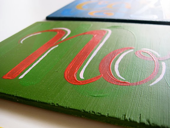
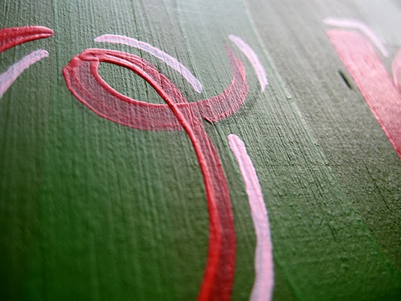
After completing a playful letter C painting for my studio last a few weeks ago, I was asked to create 2 similar letters for my dear friends, Myles & Melissa. Like the original, these 6" x 6" hand painted signs were done with acrylic on pre-mounted balsa wood canvas. A few more shots below.

Happy anniversary, Myles and Melissa! I hope these paintings bring your much merriment for years to come.

Commissions like these always available – just send me an email!

Depict Magazine


Good news! My Yes, Let's! sheets were featured in the January issue of Depict, a new, infographic-based magazine in Toronto. I created these productivity and task management sheets back in 2012 to make less desirable tasks (meal planning, working out, saving money, and weekly chores) more fun.

Remember, you can download your FREE copies of my sheets here!

Spring forward


Last week, I created a special spring chalkboard for Hanks Cafe at 9 1/2 Church St.

Here's a peek at original rough sketch:

Happiest Friday!


What great news for a Friday: my hand painted signs were featured on Quipsologies!

Get your limited edition sign today over at my shop. Only 3 remaining!

Have a great weekend!

CR


Lino printing workshop


I'm super excited to be co-hosting Ligatures first lino printing workshop with my talented friend Tanya Roberts on Sunday, March 23. We are so grateful to be holding the event at Coach House Press, surrounded by beautiful paper stock, colourful inks, and historic printing presses. If you sign up, you may even have the opportunity to print your proofs on a Vandercook press!

Cost to participate is $25, and space for this event is limited.
Please sign up today!

Linotype: The Film


I'm so exciting about Ligatures' screening of the Linotype film, happening one week from today at Coach House Books. RSVP on the Ligatures blog.

Much thanks to Tanya Roberts and Paul Dotey for helping make this event poster come to life!

A new friend


Here's a little marquee letter-inspired painting a created for my studio last week. Primary acrylic colour scheme on a 6" x 6" balsa wood canvas board.

Commissions always available!

New to the shop: Hand-painted signs


If you follow me on Instagram, you've probably noticed that I've been having a great time experimenting with acrylic. In mid-February, I acquired some remnant wood from a hardware store, and decide to try my hand at sign painting. These were the results, which are now available for purchase in my shop.

Home Sweet Home $40


Carpe Diem $40


No Pain, No Gain $40


Stay Hungry, Stay Foolish $40 - SOLD

Each one-of-a-kind, 13 3/4" x 4 7/8" sign is hand-painted with acrylic on 3/16" wide balsa wood.

Commissioned signs always available – please contact me for more details.

Watch for more signs coming soon!

Two-word truths #3


The third installment of "Two-word truths" is now available! You can pick up "Take care" in the shop for for $20. These 9" x 9" limited edition lino prints are based on original hand-lettering by yours truly. Printed in black ink on bright white 250gsm cotton archival paper. Lots of photos below.

And don't forget: you can still take advantage of the "Two-word truths" print-of-the-month subscription. For $120 (a 50% savings!), you can pre-purchase all 12 prints and receive a new print in your mailbox at the beginning of each month. You can subscribe at any point during the year – I will simply send you all the prints that have been released up to that date.

Or, pick up a single copy of "Take care" in the shop today!

Thanks for your support!